")
Interface Usability Evaluation
Interface Usability Evaluation is emphasized as a door to the content contained in the digital collection (Nielsen J. , Usability engineering, 1993). As much as interfaces play important roles for digital libraries, interface usability evaluations are important for users to use them with facility. Three interface usability criteria are chosen emphasizing importance of ease of use, consistency, and visual design, because they are main factors to engage users to navigate readily websites. These three criteria will check whether a digital library can engage users without troubles or difficulties.
Interface Usability Evaluation Criteria
Convenience (Ease of Use)
According to Usability.gov, ‘Ease of learning’ and ‘Efficiency of use’ are two of main usability evaluation factors. Ease of use/ convenience is very important for users to visit, navigate, and use digital libraries for their purposes and satisfaction. Also, all organized web pages by priority are useful to understand easily (Usability.gov). Therefore, Ease of use/Convenience evaluation criterion is chosen to check whether users can use and find information easily browsing and scanning the candidate.
Convenience criterion checks the following as the check lists:
- Whether it is easy for users to learn and use the digital library in browsing and scanning, or whether it is easy to navigate to from most pages.
- Whether it has flexibility and efficiency of use (how fast can a user accomplish tasks in a digital library), or whether it provides the services: hidden details, size changeable (larger text), quick links, menu, advance searching, variable languages, or being able to turn back home in anywhere and adding a comment in anywhere for structure flexibility and efficiency.
- Whether related information and functions are clustered together, or whether it has less complex structures for users to find information and to surf the structure.
- Whether it has help documents and it is helpful to solve errors (how much users can recover from these errors through help documents), and
- Whether it gives users subjective satisfaction.
That is, it checks whether the candidate is easy for users to navigate to their most pages.
Interfaces’ Consistency Evaluation Criteria
Jakob Nielsen points out that the first and second big mistakes in designing interfaces are non-standard Graphical User Interface controls and inconsistency in ‘Top-10 Application-Design Mistakes.” They cause confusion when an interface uses different words or commands for the same thing (Nielsen J. , 2008). Usability.gov states guidelines to assure interfaces’ consistency: place important items consistently toward the top and center of the page; “do format common items consistently” including fonts and layout of each page; and “ensure visual consistency of website elements within and between webpages” even between data entry and data display (Usability.gov). Clearly recognizable look and feel will also engage users (Usability.gov). That is, if interfaces are consistent, it will reduce confusion for users to use them.
Therefore, Interfaces’ Consistency Evaluation Criterion is chosen to check the following as the check lists:
- Whether it uses the same words, situations, or actions in meaning the same thing in the same place.
- Whether it uses the same color, font, graphics, and layout among web pages. And,
- Whether it has consistency between data entry and data display.
Visual Design and Aesthetic Appeal Evaluation Criteria
Usability.gov emphasizes the importance and guidelines of Visual design and aesthetic appeal. A well-constructed (visual design) homepage will project a good first impression to all who visit the site (Usability.gov). For it, a homepage should visibly communicate the site’s purpose, and contain a limited amount of text appropriately being aligned on the pages and showing a moderate amount of white space (Usability.gov). Icons should be visually and conceptually distinct but harmonious with appropriate screen density. For visual and aesthetic design, designers should use unique and descriptive headings using black text and high-contrast backgrounds colors to help users understand the grouping of related information (Usability.gov). Also, attention-attracting features such as animation, bold colors and size differentials can be used carefully. The visual design should inform about “what is going on to users in an interface … supporting undo and redo … with high search engine visibility” (Usability.gov).
Therefore, Visible design and Aesthetic Appeal evaluation criterion is chosen to check the following as the check lists:
- Whether it communicates clearly and visibly the purpose and value of the interface with unique and descriptive headings and sub headings.
- Whether it has visibility, informing about what is going on to users in an interface, with “emergency exit”, undo, redo, back to top, more, print view, link to this page, and paths.
- Whether it has minimalist design, not containing irrelevant or rarely needed information.
- Whether it has a clearly recognizable look and feel that will engage users, not showing unfocused and untidy look, so that users are willing to use the websites without hesitation.
- Lastly, whether it has attention-attracting features, such as animation, bold colors and size differentials with appropriate screen density.
Methodology
After evaluating Accessibility, sixty two candidate digital libraries are evaluated again for their interfaces usability as follows:
- with three Usability evaluation criteria: Convenience, Interfaces’ Consistency, and Visible Design and Aesthetic Appeal Evaluation criteria.
- with check lists for each criterion, so that through the check lists, usability of each digital library can be enough evaluated by each criterion.
- by a heuristic method to evaluate those digital libraries with the check lists of three criteria.
- Investigator spends some time reviewing each digital library going through several times the interface of the digital library, and then evaluate closely the digital library, inspecting whether it satisfies each check list.
- Each check list is scored as one point in 5-point scale, when the digital library satisfies it. But, how much it satisfies each check list is not measured, because evaluating sixty two digital libraries was considerable work, and it took a long time to evaluate all of them.
- Calculate an average with three evaluated scores of Convenience, Interfaces’ Consistency, and Visible Design and Aesthetic Appeal Evaluations.
- The high average tells that the digital library provides good Usability in Convenience, Interfaces’ Consistency, and Visible Design and Aesthetic Appeal.
Results and Analyses
Results and Analyses of Convenience/ Ease of Use Evaluation
As a result, 36.5% of sixty two digital libraries satisfy perfectly five check lists for Convenience/ Ease of Use. 77.8% of sixty two digital libraries satisfy more than four check lists of the interface criteria. Only 6.3% of those digital libraries gained 1 or 2 points in 5-point scale, as they provide lower convenience.
Therefore, generally we can say that many digital libraries of sixty two candidate digital libraries provide convenience/ease of use.
Findings:
- Generally, almost all digital libraries provide convenience services. Users can learn and use those digital libraries without troubles in browsing and scanning or in navigating to from most pages.
- Almost all digital libraries cluster related information and functions together showing less complex structures for users to find information and to surf the web sites.
- Most digital libraries provide flexibility and efficiency of use providing one of the services: hidden details, size changeable (larger text), quick links, menu, advance searching, variable languages, or being able to turn back home in anywhere and adding a comment in anywhere for structure flexibility and efficiency.
- However, some digital libraries do not provide help documents for users to solve their problems by themselves, even though they are the candidate digital libraries in each subject domain.
- Lastly, few digital libraries give user satisfaction in Usability.
International Children’s Digital Library Case
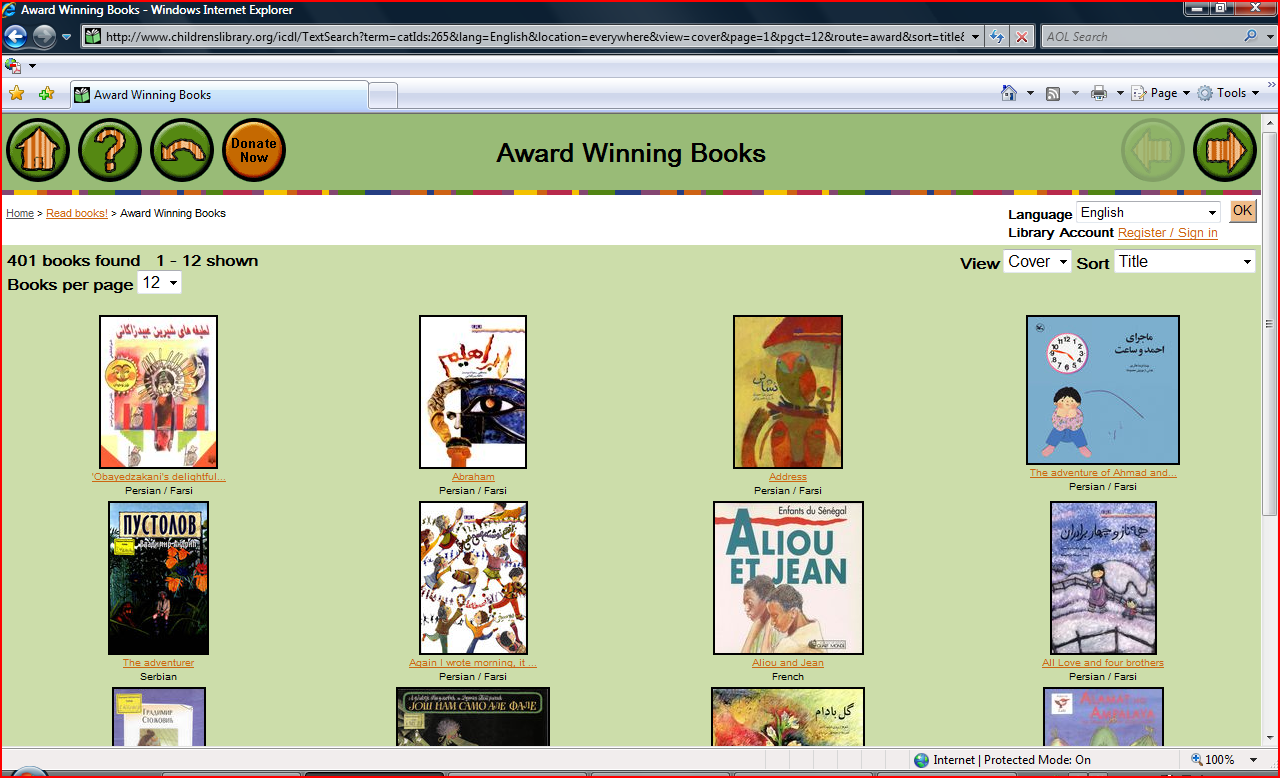
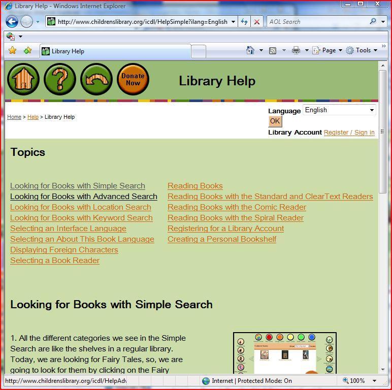
For instance, International Children’s Digital Library, http://en.childrenslibrary.org/, provides very good Usability in Convenience/ Ease of Use. It is very easy to use and navigate the digital library, because it is developed for children to be able to access any information in it. As the below figures show, the web page of International Children’s digital library shows that related information is clustered together. The library offers much flexibility and efficiency providing services: being able to turn back home page in anywhere, returning previous page, providing variable languages and sorting methods. Besides, the bottom menu improves flexibility and efficiency in use. And, the library provides good help documents in every page. Thus, we can say that it gives enough user satisfaction in Convenience/ Ease of Use.
Results and Analyses of Interface Consistency Evaluation
As a result, over half, 58.7%, of sixty two digital libraries satisfy perfectly three check lists of interface consistency. Only 3.2% of sixty two digital libraries gained the lowest point, 2 points out of 5 points by three check lists of interface consistency.
The results show that the candidate digital libraries have higher Interface consistency than Convenience and Visible design and Aesthetic Appeal in Usability Evaluation. The reason why they provide much consistency than others may be that consistency is essential in designing web sites.
Findings:
- Many digital libraries provide Interface Consistency among web pages.
- Most digital libraries provide consistency in using the same words, situations, or actions in meaning the same thing in the same place.
- And most digital libraries use the same color, font, graphics, and layout among web pages.
- However, some digital libraries do not keep consistency between data entry and data display. Actually, it seems difficult to keep consistency between data entry and data display.
Results and Analyses of Visible Design and Aesthetic Appeal Evaluation
As a result, 34.9% of the candidate digital libraries satisfy perfectly the presented five facts/check lists. Only 7.9% of those digital libraries gained 2 points out of 5 points with the five factors or checklists. Although the total average of Visible Design and Aesthetic appeal criteria is lower than the total average of Interface Consistency criteria, many candidate digital libraries seem to provide good Visible Design, but less Aesthetic appeal in Usability Evaluation.
Findings:
- Mostly, the candidate digital libraries communicate clearly and visibly the purpose and value of the interface with unique and descriptive headings and sub headings. Also, they have minimalist designs, not containing irrelevant or rarely needed information.
- Many digital libraries provide a clearly recognizable look and feel that will engage users, not showing unfocused and untidy look. So users are willing to use the websites without hesitation.
- However, some digital libraries (not many of them) provide obvious visibility. They inform about what is going on to users in an interface, with “emergency exit”, undo, redo, back to top, more, print view, link to this page, and paths.
- Also, few digital libraries show attention-attracting features, such as animation, bold colors and size differentials with appropriate screen density.
- Especially, Art and Science subject domains’ interfaces show notable Aesthetic Appeal with attention-attracting features with animation, bold colors and size differentials with appropriate screen density.
Overall, language and literature subject domain has the highest average value in Visible Design and Aesthetic appeal. On the other hand, education subject domain has the lowest average value in Visible Design and Aesthetic appeal evaluation.
Analyses of Interface Usability Evaluations with Three Criteria
Differences between Typical Heuristic Evaluation and the Used Method in the Prototype
Nielsen argues that involving multiple evaluators is more possible to improve the effectiveness of heuristic method, normally three to five evaluators. An example of cost of a heuristic evaluation is $3,700 – $4,800. The adjustable cost of each evaluator is estimated to $410 -$900 (Nielsen J. , 1995).
However, the prototype is to evaluate generally Interfaces’ Usability of sixty two digital libraries for several months. If we want to involve more evaluators, we should find more than twenty to thirty evaluators so that each evaluator can evaluate merely two or three digital libraries deeply and in detail. The total cost for a heuristic evaluation is estimated to $8,200- $27,000. It is huge amount for a graduate student to pay without funding.
Therefore, the heuristic evaluation for the project is a little different with the general heuristic evaluation method that Nielsen describes. That is, the project places emphasis on investigating whether the digital libraries provide general Interfaces’ Usability with the carefully prepared checklists. I, Boaz Sunyoung Jin, evaluated sixty two candidate digital libraries for several months. I investigate whether the digital libraries provide each check list for each criterion, not being able to investigate the interface minutely, and to detect detail usability problems deeply with detail results. But, the check lists for each usability criteria prepared thoughtfully so that various viewpoints of usability for each usability criteria can be evaluated. I spent some time to investigate and navigate each digital library, navigating most web pages for each digital library. As a result, the checklists for each Usability criteria play crucial roles to evaluate digital libraries in each subject area.
Analyses based on Averages of Three Interface Usability Evaluations
Findings:
- The digital libraries in Language, Art, and Geography subject domains show the highest average in Interface Usability evaluations.
- But, the digital libraries in Philosophy, Education, and Military Science subject domains show the lowest average in Interface Usability evaluations with three interface usability criteria: Convenience, Interfaces’ consistency, and Visible design and Aesthetic Appeal.
The Figure 1 shows averages of Convenience, Interfaces’ Consistency, and Visible design and Aesthetic Appeal Usability Evaluations in fifteen subject areas. While some digital libraries show similar averages among evaluations by three usability criteria, several digital libraries such as in Education subject domain show wide differences. This may imply that some digital libraries should improve especially some fields of Convenience, Consistency of interfaces, or Visible design and Aesthetic Appeal.
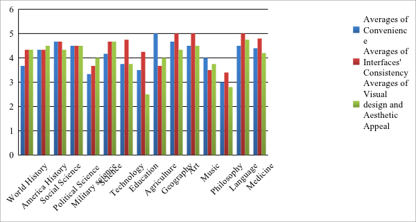
Figure 1. Comparing Averages of Interfaces Usability Evaluations in Fifteen Subject Areas
Total Analyses and discussions of Interface Usability Evaluations
To sum up the results of evaluating Usability,
- Many digital libraries provide Convenience services clustering related information together, and Interface Consistency among web pages.
- But, oddly, some digital libraries still do not provide help documents for users to solve problems by themselves, although they are candidates of well-designed digital libraries in fifteen subject areas.
- Providing flexibility and efficiency of use needs to be developed in existing digital libraries. Some digital libraries do not inform about what is going on to users in an interface.
- Providing more visibility is required to be developed.
- Consistency between data entry and data display turns out as the weakest point in Interfaces’ Usability of the digital libraries. Although it is difficult, it may be worthy to keep consistency between data entry and data display.
- Lastly, very few digital libraries provide attention-attracting features in Aesthetic Appeal Usability evaluation. However, it is true that users are willing to use attention-attracting features’ interfaces. Providing Aesthetic appeal is essential to engage more users.
The highest Average digital library by Interface Usability Evaluations in each subject domain
The Table shows the digital libraries that show the highest average in each subject domain by a descending series. The evaluations are implemented with three usability criteria: Convenience, Interface Consistency, and Visible Design and Aesthetic appeal criteria.
| Subject Area | The Highest Score Digital Library(ies) in each Subject Area |
| <Perfect Score: 5> | (5: Total average of three evaluation scores) |
| Science | National science Digital Library |
| History of the America | American Journeys |
| Social Science | The National Archives, Education Resources, UK |
| Political Science and Law | Civil Rights Digital Library |
| Geography | Census Atlas of the United States |
| Arts | NYPL Digital Gallery |
| Language and literature | International children’s Digital Library |
| Medicine | National library of medicine |
| <Almost perfect score: 4.67> | |
| World History and history of Europe (Asia, Africa, Australia, New Zeal, and ETC) | British Library Online Gallery |
| Agriculture | National Agricultural Library Digital Repository |
| Music and books on music | Database of Recorded American Music |
| <Most Perfect Score: 4.33> | |
| Technology | National Institute of Standards and Technology |
| Military science | US Military Academy Digital Collections |
| Education (4) | The National Library of Education |
| Philosophy, psychology, religion | Association of Religion Data Archives |
*More details are in the paper, Chapter V. Usability Evaluation, 2. Interface Usability Evaluation. This website and the paper are developed by the same person.